This 5-part series is about how I would correct/fix various design issues within the Toronto Transit Commission (TTC). This is not about how I would change bus routes, or how one mode is better or worse than another mode (i.e., LRT vs. Subway). This is about how I believe the TTC (and other transit authorities) can improve the experience of engaging and interacting with it’s ridership (actual and potential). Here is part three.
Subway Stations (part a)
Currently there are 69 subway stations within the TTC system. And each has at least one entrance into the station – giving access to all vehicles within the structure. There are some stations that have no other modes other than subway – like Chester. One station entry point is always attended by a collector. There are various design configurations depending on volume and layout.
Two and separated – Yonge/Bloor has two collector booths that face each other, with a bank of exit turnstiles between them. There are also two large alternate entrances (the gates that can be swung open for people with disabilities, large suitcases, and they can also be used as an overflow entrance manned by an employee during peak times).
Two and together – the College station (in case you still need the Carlton Car) sees the two collectors in the same booth, back-to-back. This design has the exit turnstiles and alternate entrance on either side.
In above versions there is the allowance for two collectors, although that usually only happens during peak times.
Single – Stations like Castle Frank find the collector booth against one side wall, with the exit turnstiles and alternate entrance between the booth and the opposite wall.
Unmanned – There are two variations for this; 1, a former collector booth, like at the Yonge entrance at Yonge-Bloor has the booth part but is ONLY accessible by token or metropass, or 2, like the bank of token/metropass turnstiles at the St. Andrew entrance (although they reside in the same area as a collector booth, they are really a set of entrances on their own).
Information Overload/Underload
Each of these entrances presents their own problems from flow and spatial design considerations, I will be talking about the visual, information aspects about the entrances – granted the flow and spatial aspects might come into play.
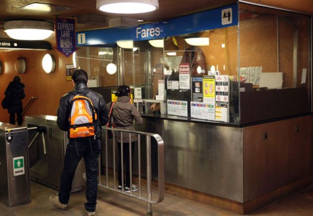
Firstly the collector is a limited description of the job, they are in fact: Collector, Security Guard, Information Kiosk (both TTC and the local area), Metropass/Token sales agent, Emergency Notification (if something happens in the station), Remote (when you happen to be at an unmanned entrance, and you press the ‘talk to someone’ button), etc. So for each of these tasks the booth is both a plus and a minus.
Given that a large part of the collectors job is not just to monitor the collection of the fare – they are engaged in conversations with the public (riders and potential riders). To that end having the entrance turnstile right at the place where said conversations are happening is myopic. All the while you have a line-up of people wanting to buy their monthly metropasses. It’s also the place of contact for any surface route connections that require entrance with a transfer (like Lansdowne). A minor solution would be to move the turnstile forward a metre or so – allowing flow for those that have tokens or metropasses or transfers. Thereby facilitating the conversations that might need to take place at the window wicket.
More than talking
Beyond the conversation, another reason that the passage way to the main turnstile might get blocked is because of the plethora of information signage on the booth windows. There are at minimum seven–ten of these ranging from fare notices to restricted items indications. All of these with different colour systems, fonts, sizes of fonts, etc. It’s a graphic salad of the worst kind. It’s bad not only because of the visual smorgasbord but due to the fact that it impares the safety vision of the collector. A better solution would be to have an information board – that is accessible for all, and does not impede traffic or safety.
There is somewhat a system in place that shows a local map – this would a great place to start. Combining all of the station/TTC/vicinity information into one super didactic area. It should also connect up with the colouring system that the TTC has in place for each subway line. And without beating a dead horse, this information can be presented on a digital sign board – allowing for updates and modifications easily. A digital sign I would keep at the booth entrance is anything related to fare and train information. Right now at myriad stations there is a hand-written sign indicating the last train leaving that station, on that day. Hand written signs in any situation reek of a unprepared, unprofessional social encounter – not reflective of employees as much as management.
Assuming that everyone that rides the TTC is a familiar with the workings of the TTC is a stretch. Even for seasoned riders, heading to a new destination brings it’s own set of challenges. Keeping that in mind allows design decisions to be made that benefit all parties involved – riders and employees. Ultimately the purpose of any set of signage or related wayfinding systems is to help with flow and passage – not hinder.
What other ways could you suggest to improve the entrance experience at a transit station?
